How to make your header, navigation and footer full width in Blogger.
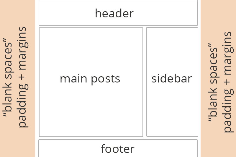
The way your template is set up is to have margin, padding and
max-width values to “construct” your layout. In order to make your
header, navigation or footer full width we have to remove these and
re-add them to just the main content (post area + sidebars).
Please note that this is just to make the area wider, so you can
apply CSS to the full screen. If you’re using a header image and the
image is only 900 pixels in width, this tutorial won’t alter that. It
will allow you to add a background colour using CSS to span the full
width of the screen behind your image.
Before + After Example
Rollover/Hover-over the image to see a before and after example
Q. What are those values with the $ beforehand in my template?
Any code in your template that looks similar to$(example);
is basically code that’s controlled by the Variables at the top of your
CSS and is used by the Template Designer (Template > Edit >
Customise). You can edit the default variable code or edit the main CSS
area (changing from variable values to “real” values such as a colour or
number) but if you remove the variable code then altering the related
options in Template Designer won’t work so take care when doing so. More
on this in a future tutorial.How to make your header, navigation + footer full width
You can do this by editing the variable values as explained above which I plan to do a post on in the future, but we’ll stick to editing the main CSS as it’s easier to explain and understand. Please not that code shown below may look different in your template.1. First we need to go to your main CSS area. Go to Template > Edit HTML and click the black arrow on the left beside the following code
<b:skin> ... </b:skin> <b:skin> and </b:skin> search for body, it’s one of the first codes. You’ll see code similar to
body {
  font: $(body.font);
  color: $(body.text.color);
  background: $(body.background);
  padding: 0 $(content.shadow.spread) $(content.shadow.spread) $(content.shadow.spread);
  $(body.background.override)
}
Change the
padding: 0 $(content.shadow.spread) $(content.shadow.spread) $(content.shadow.spread); padding: 0px;3. Search for
.content-inner.
This is the section that wraps (combines) your header, navigations,
posts, sidebar and footer. Search for it, skipping the variable section
and find something that looks like
.content-inner { padding: $(content.padding) $(content.padding.horizontal); }This is the code we talked about earlier. The
$(content.padding) is defaulted to 10px and $(content.padding.horizontal)
is 40px as set in the variable section. We want to remove this 40px
padding that’s on either side of our content so that the header won’t
have spaces. Change it to look like
.content-inner { padding: $(content.padding) 0px; }or if you prefer
.content-inner { padding: 10px 0px; }4. Now look for the section of your template below
</b:skin> that looks like
<b:template-skin> ... </b:template-skin>5. In between
<b:template-skin> and </b:template-skin> search for .content-outer, .content-fauxcolumn-outer, .region-inner and find something similar to.content-outer, .content-fauxcolumn-outer, .region-inner {
min-width: $(content.width);
max-width: $(content.width);
_width: $(content.width);
}Change
max-width: $(content.width);max-width: 100%;this will change our blog width to be the full size of the browser.
6. Find
]]> </b:template-skin>and add the follow code above it to change the main content area (posts + sidebar) your blog width and centred.
.main-outer { max-width: $(content.width); margin: 0 auto; }or
.main-outer { max-width: 1000px; margin: 0 auto; }7. Again find
</b:skin> and add the following above it .tabs-inner { padding: 0px; } .section { margin: 0px; } .header-inner .widget {margin: 0px; }8. Save the template and you should be able to see a full header, navigation and footer area now with your main content staying the same width as before. I’ve tested this in all default Blogger Templates and it works, a few templates need more/less editing that others.


