Showing posts with label Custom_settings. Show all posts

Sunday, 22 May 2016

Make header, navigation and footer full width in Blogger

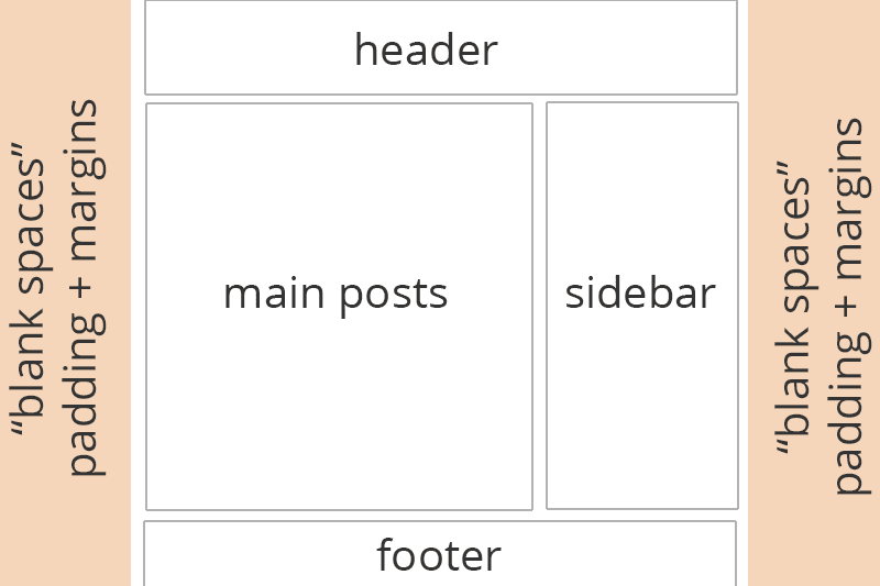
How to make your header, navigation and footer full width in Blogger. The way your template is set up is to have margin, padding and max-width values to “construct” your layout. In order to make your header, navigation or footer full width we have to remove these and re-add them to just the main content (post area + sidebars). 

Please note that this is just to make the area wider, so you can apply CSS to the full screen. If you’re using a header image and the image is only 900 pixels in width, this tutorial won’t alter that. It will allow you to add a background colour using CSS to span the full width of the screen behind your image.

Before + After Example

Rollover/Hover-over the image to see a before and after example


Q. What are those values with the $ beforehand in my template?

Any code in your template that looks similar to $(example); is basically code that’s controlled by the Variables at the top of your CSS and is used by the Template Designer (Template > Edit > Customise). You can edit the default variable code or edit the main CSS area (changing from variable values to “real” values such as a colour or number) but if you remove the variable code then altering the related options in Template Designer won’t work so take care when doing so. More on this in a future tutorial.

How to make your header, navigation + footer full width

You can do this by editing the variable values as explained above which I plan to do a post on in the future, but we’ll stick to editing the main CSS as it’s easier to explain and understand. Please not that code shown below may look different in your template.
1. First we need to go to your main CSS area. Go to Template > Edit HTML and click the black arrow on the left beside the following code


<b:skin> ... </b:skin>
 
 
2. In between <b:skin> and </b:skin> search for body, it’s one of the first codes. You’ll see code similar to
body {
  font: $(body.font);
  color: $(body.text.color);
  background: $(body.background);
  padding: 0 $(content.shadow.spread) $(content.shadow.spread) $(content.shadow.spread);
  $(body.background.override)
}

Change the
 
padding: 0 $(content.shadow.spread) $(content.shadow.spread) $(content.shadow.spread);
to
 
padding: 0px;

3. Search for .content-inner. This is the section that wraps (combines) your header, navigations, posts, sidebar and footer. Search for it, skipping the variable section and find something that looks like
 
.content-inner { padding: $(content.padding) $(content.padding.horizontal); }

This is the code we talked about earlier. The $(content.padding) is defaulted to 10px and  
 $(content.padding.horizontal) is 40px as set in the variable section. We want to remove this 40px padding that’s on either side of our content so that the header won’t have spaces. Change it to look like
 
.content-inner { padding: $(content.padding) 0px; }

or if you prefer

 
.content-inner { padding: 10px 0px; }

4. Now look for the section of your template below </b:skin> that looks like
 
<b:template-skin> ... </b:template-skin>

5. In between <b:template-skin> and </b:template-skin> search for .content-outer, .content-fauxcolumn-outer, .region-inner and find something similar to

.content-outer, .content-fauxcolumn-outer, .region-inner {
        min-width: $(content.width);
        max-width: $(content.width);
        _width: $(content.width);
      }

Change
 
max-width: $(content.width);
to
max-width: 100%;

this will change our blog width to be the full size of the browser.
6. Find
 
]]> </b:template-skin>

and add the follow code above it to change the main content area (posts + sidebar) your blog width and centred.
 
.main-outer { max-width: $(content.width);  margin: 0 auto; }

or

 
.main-outer { max-width: 1000px;  margin: 0 auto; }

7. Again find </b:skin> and add the following above it

 
.tabs-inner { padding: 0px; } .section { margin: 0px; } .header-inner .widget {margin: 0px; }

8. Save the template and you should be able to see a full header, navigation and footer area now with your main content staying the same width as before. I’ve tested this in all default Blogger Templates and it works, a few templates need more/less editing that others.

Read More »

Saturday, 21 May 2016

How To Remove Extra Space From Blog Header


Note:- Before making any changes to blogger template it better to take a backup of existing template. This really helps if some thing goes wrong you can go back to current state.


Just take a look the blog and see how much extra space its showing.


Step 1:


- Login to your blogger account.
- Click on Template Link on left sidebar
- Click on ‘Customize’ button.


Step 2:

- Go to Advanced –> Add CSS. This will show the CSS window as well your blog below it. As soon as you add the CSS object it shows its impact live so that you will know how the blog will look after this change.


Step 3:

- Paste the below code in the ‘Add custom CSS’ box. Adjust the values based on your look and feel. I love to add comment so that you will know what you have customized if later point of time you need to look back and check.

/* Tech G lab - Removing Extra Space - Above Header Box*/
.content-inner 
{margin-top: -40px !important; 
}

/* Tech G lab - Removing Extra Space - Left and Right Margin*/
.header-inner 
{
margin-left: 0px !important;
margin-right:0px !important;
}

/*Tech G lab - Removing Extra Space - Header Top and Bottom Margin*/
.Header h1
{
margin-top: -20px !important;
margin-bottom:-20px !important;
}

/*Tech G lab - Removing Extra Space - Setting Padding*/
.header-inner .Header .titlewrapper 
{
padding: 0px 20px;
}

/*Tech G lab - Removing Extra Space - Around Description*/
.header-inner .Header .descriptionwrapper 
{
padding: 0 30px;
}

/*Tech G lab - Removing Extra Space - Around Description*/
.Header .description
{
margin:0 0 -10px 0;
padding:0 10px
}


Step 4:

- Once you feel the outcome is good, click on Apply to Blog button on top right corner.
Read More »

Thursday, 19 May 2016

Add a link to blogger widget titles


How to add a link to widget titles in Blogger:

All the widget titles in Blogger have no hyper links.But we can add link to widget titles in Blogger blogs.This will works good if you add link to follows gadget like Google+ Followers gadget.With this posts we can put link in Google+ Followers widget title.

Follow below steps to add a link to widget titles in Blogger blog

Step 1 : Go to Blogger Dashboard

Step 2 : Click on Template


Step 3 : Click on Edit HTML


Step 4 : Search below code

<b:widget id='PlusFollowers1' locked='false' title='Google+ Followers' type='PlusFollowers'>
    <b:includable id='main'>
  <b:if cond='data:title != &quot;&quot;'>
    <h2 class='title'><data:title/></h2>


Replace last line of the above code with below like

<h2 class='title'><a href=" your custom url link"><data:title/></a> </h2>

Put link in the pace of your custom url link in the above code.

Step 5 : Click on Save template.


After adding link to your Google+ Followers gadget title , when you click on title then it will goes to the link added in the above code.
Read More »

Tuesday, 10 May 2016

How to change the font style, size and color of description in blogger?

Steps to write a blog description.

1. Visit the Settings section once you log-in in to your blog.

2. Select the Basic under Settings. It displays Basic, Publishing and Permissions in it.
3. Under Basic, it has Title, Description and Privacy. Now edit the Description and write your own description that describes your blog to the readers.  

Once it is written, visit your blog and see the changes you have made.


Steps to choose font color for blog description.


1. Go to Template section and click on Customize button. Blog Template Designer tool will open.


2. Select Advanced section and select Blog Description. 
3. Here you can select your favorite colour and make sure to click Apply to Blog button.

Your blog is ready with your chosen font colour for your blog description.


Click on Back to Blogger to make further changes to font by selecting your own font type and font size.


Steps to change the font type and size of blog description.


1. Select Template and click on Edit HTML button. New HTML Editor is seen.

2. Now select Header1 under Jump to Widget.
3. Expand the Header1 widget(click on arrow mark displayed at the beginning of Header1 line), you will see

<b:widget id='Header1' locked='false' title='Online Quick Guide (Header)'type='Header'>

          <b:includable id='main'>...</b:includable>
          <b:includable id='description'>...</b:includable>
          <b:includable id='title'>...</b:includable>
</b:widget> 

4. Now expand the description widget.

5. Replace the below line

<p class='description'>


with


<p class='description' style='font-family: verdana; font-size: 16px;'>


You can change font style by changing  verdana

6. Click on Save template button.


Now all the changes you have made are ready in your blog.


Read More »

Monday, 9 May 2016

Auto Read More with thumbnail for Blogger/Blogspot Posts

How to make posts in the blog homepage to be displayed with an automatic "read more" button and a thumbnail.


To be more specific, this will show the title of the post, then a short summary with a number of characters and a thumbnail, that will be the thumbnail of the first image uploaded inside the post. After the thumbnail and the post summary, there will be a "Read More" link which when you click on it, will take you to the actual post.


This <Automatic Read More script will summarize content and a post summary will be shown only on the main blog page (homepage), category pages, and archive pages.


Using the Automatic Read More feature in Blogger Posts


Step 1. From your Blogger dashboard go to template and click edit HTML button


 Step 2. Click anywhere inside the code area, then press the CTRL + F keys and search for this code:


<data:post.body/>

 Note: after hitting Enter, you'll find this code more than once but you need to stop at the second (if only two times) or third one.


Replace the code above with this one:


<b:if cond='data:blog.pageType != &quot;static_page&quot;'>

<b:if cond='data:blog.pageType != &quot;item&quot;'>
<div expr:id='&quot;summary&quot; + data:post.id'><data:post.body/></div>
<script type='text/javascript'>createSummaryAndThumb(&quot;summary<data:post.id/>&quot;,&quot;<data:post.url/>&quot;,&quot;<data:post.title/>&quot;);</script>
<span class='readmore' style='float:right;'><a expr:href='data:post.url'>Read More &#187;</a></span></b:if></b:if>
<b:if cond='data:blog.pageType == &quot;item&quot;'><data:post.body/></b:if>
<b:if cond='data:blog.pageType == &quot;static_page&quot;'><data:post.body/></b:if>

Note:  if you don't see any changes after going through all the steps, please try to replace the second
<data:post.body/>  as well

 Now search for the following tag:


</head>


 Just above the </head>  tag, add the following code:

<script type='text/javascript'>

posts_no_thumb_sum = 490;
posts_thumb_sum = 400;
img_thumb_height = 160;
img_thumb_width = 180;
</script>
<script type='text/javascript'>
//<![CDATA[
function removeHtmlTag(strx,chop){
if(strx.indexOf("<")!=-1)
{
var s = strx.split("<");
for(var i=0;i<s.length;i++){
if(s[i].indexOf(">")!=-1){
s[i] = s[i].substring(s[i].indexOf(">")+1,s[i].length);
}
}
strx = s.join("");
}
chop = (chop < strx.length-1) ? chop : strx.length-2;
while(strx.charAt(chop-1)!=' ' && strx.indexOf(' ',chop)!=-1) chop++;
strx = strx.substring(0,chop-1);
return strx+'...';
}
function createSummaryAndThumb(pID, pURL, pTITLE){
var div = document.getElementById(pID);
var imgtag = "";
var img = div.getElementsByTagName("img");
var summ = posts_no_thumb_sum;
if(img.length>=1) {
imgtag = '<span class="posts-thumb" style="float:left; margin-right: 10px;"><a href="'+ pURL +'" title="'+ pTITLE+'"><img src="'+img[0].src+'" width="'+img_thumb_width+'px" height="'+img_thumb_height+'px" /></a></span>';
summ = posts_thumb_sum;
}

var summary = imgtag + '<div>' + removeHtmlTag(div.innerHTML,summ) + '</div>';

div.innerHTML = summary;
}
//]]>
</script>

<b:if cond='data:blog.pageType != &quot;static_page&quot;'>

<b:if cond='data:blog.pageType != &quot;item&quot;'>
<style type='text/css'>
.post-footer {display: none;}
.post {margin-bottom: 10px; border-bottom: 1px dotted #E6E6E6; padding-bottom: 20px;}
.readmore a {text-decoration: none; }
</style>
</b:if>
</b:if>

Note: 

- To change the number of characters shown when there is no thumbnail, modify the 490 value in blue. For the number of characters shown when a post has a thumbnail, modify the 400 value


- If you want larger thumbnails, modify the 160 (height) and 180 (width) values in red 

- If you want add read more button instead of Read more>> text 

find <a expr:href='data:post.url'>Read More &#187;</a>  code in template and replace with below code

<a expr:href='data:post.url'>
   <input type='button' value='Read More'/></a>


Step6: Click on Save the template button to save changes. 


Read More »

Remove Empty Space Above Blogger / Blogspot Header


There's a huge empty space left on top of the blog's header after you remove the Blogger Navbar. This space often interferes with the blog's design by pushing down the header. It can be utilized to display - ads, navigation menu, social networking buttons and much more. So why waste it? 

Here's how you get rid of the empty space left after removing the navbar:


1. Log in to your blogger account


2. Go to Template -> Click Edit HTML and then Proceed.


3. Using Ctrl+F look for </head> tag:


4. Now add the following code just above the </head> tag:


<style type='text/css'>
.content-inner 
{ 
margin-top: -40px !important; 
}
</style>

5. Preview the template before saving.
Read More »